Your homepage has five seconds. Use them well.
Visitors decide in seconds whether to stay or leave. Clever is nice, but clear is what keeps them. Here is how to make the first five seconds count.
The five-second test
Show your homepage to someone who has never heard of you. Close it after five seconds. Ask them: what does this business do, who is it for, and what should I do next? If they cannot answer all three, your homepage is working too hard at being impressive and not hard enough at being understood.
1. Say what you do, plainly
“Elevating digital experiences through innovation” sounds lovely and means nothing. “Websites for Cape Town restaurants that fill tables” tells people exactly whether they are in the right place. Your headline is not the place to be mysterious.
2. Say who it is for
The right visitor should feel like you are talking to them. Name the customer, their problem or their location. Trying to speak to everyone usually means speaking to no one in particular.
3. Give one obvious next step
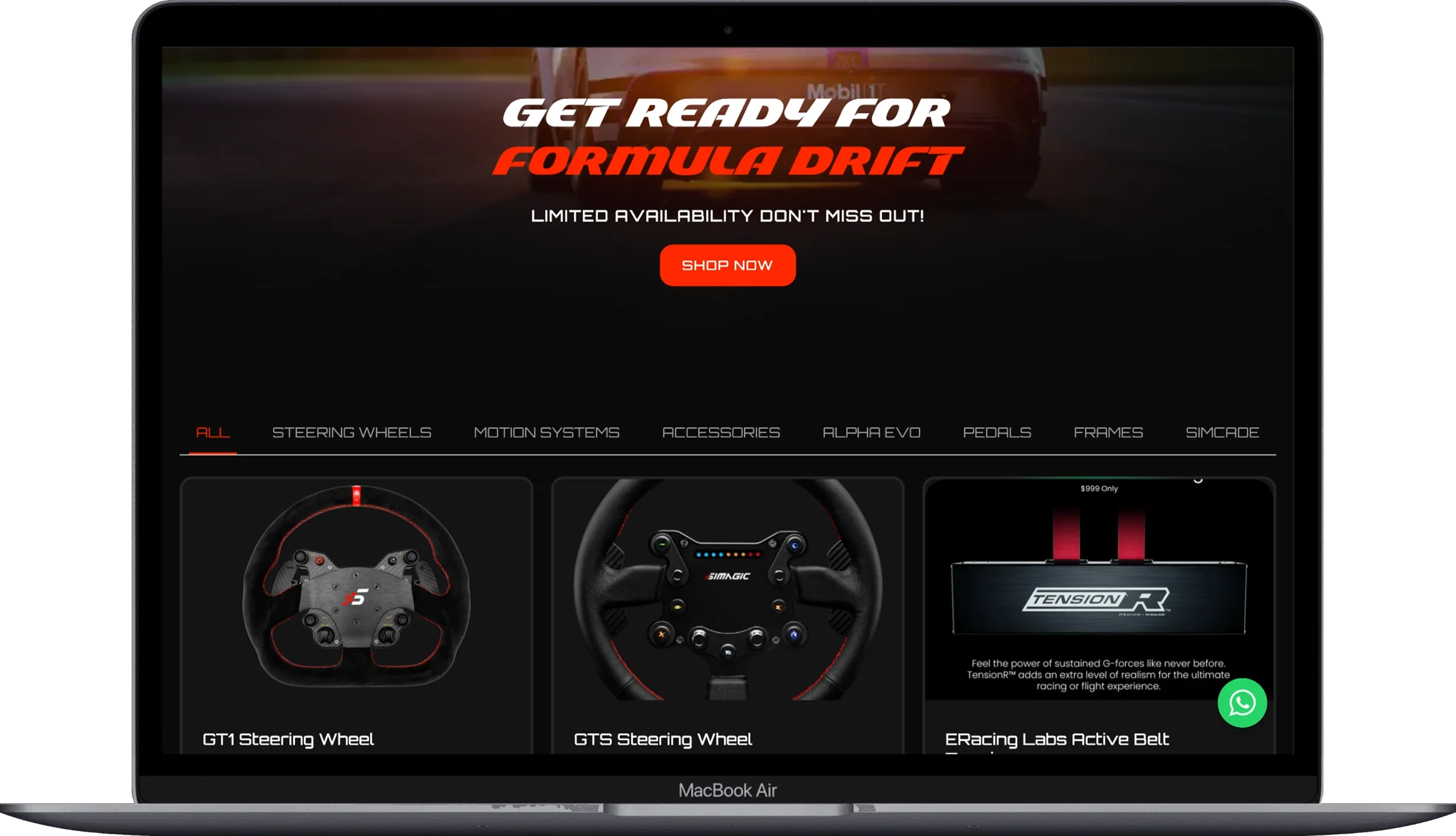
One main button, worded clearly: “Book a table”, “Get a quote”, “Shop rigs”. Five competing buttons is not choice, it is homework.
4. Let the layout do the guiding
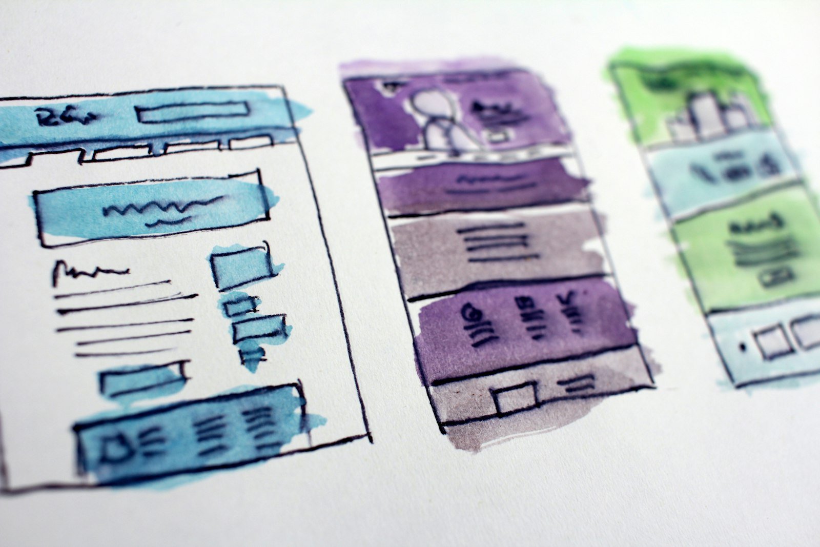
Big things first, details later. A strong headline, one supporting line, a clear call to action, then proof: work, reviews, numbers. Every section should answer the next question a visitor is likely to have.
5. Use motion with manners
Subtle animation can make a site feel alive and premium. Animation that delays the content, spins for attention or makes people wait is just friction in a nice outfit.
Creative and clear are not enemies
Great design is not about choosing between personality and clarity. It is about making the clear version look good. That is the bit we love doing. If your homepage fails the five-second test, let’s fix that.